
Ready to master charts using Highcharts in Angular? If you need to transform raw data into beautiful, interactive visualizations within your Angular 18 application, this is the right place for you. Data lies at the core of modern applications, and its effective presentation can make all the difference for your users. This guide will be your perfect starting point. We are going to take you through everything you need to know, right from the initial setup to creating a fully functional chart.
Highcharts: Introduction and Installation
Highcharts is a powerful and flexible JavaScript charting library written in pure SVG. It allows developers to create a wide variety of interactive charts, from simple line and bar charts to complex heat maps and stock charts. Developers love it because it’s well-documented, highly customizable, and works seamlessly across all modern browsers and devices.
First, ensure you have an Angular 18 project ready. If not, create one with ng new my-chart-app –standalone.
Now, let’s begin the process to integrate Highcharts in Angular 18. Open your terminal in the project’s root directory and run the following command to install Highcharts and its official Angular wrapper:
npm install highcharts highcharts-angular@4.0.0It will install two libraries one is for highchart core files and another one is wrapper for angular.
Example of Creating Chart Using HighChart into Angular
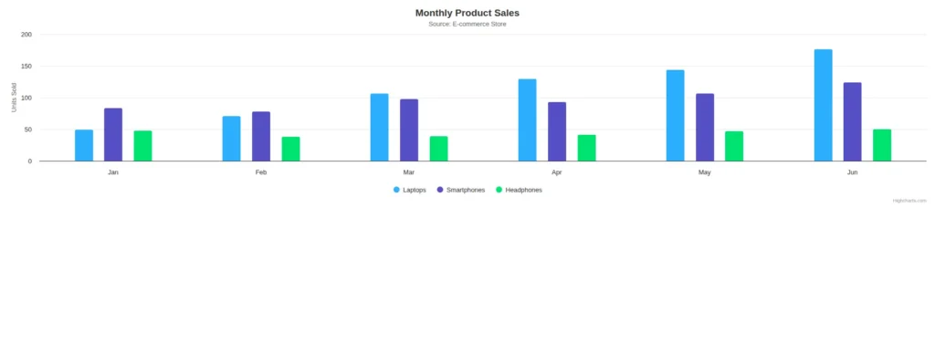
We will create a real-world example: a column chart that displays monthly product sales for an e-commerce store. This is a fantastic way to visualize performance over time. We will work directly within our main app component. In a default Angular 18 project, this will be a standalone component.
Open app.component.ts and replace its content with the following code.
import { Component } from '@angular/core';
import { CommonModule } from '@angular/common';
import { RouterOutlet } from '@angular/router';
import { HighchartsChartModule } from 'highcharts-angular';
import * as Highcharts from 'highcharts';

@Component({
  selector: 'app-root',
  standalone: true,
  imports: [CommonModule, RouterOutlet, HighchartsChartModule],
  templateUrl: './app.component.html',
  styleUrl: './app.component.css'
})
export class AppComponent {
  title = 'my-chart-app';

  Highcharts: typeof Highcharts = Highcharts;
  chartOptions: Highcharts.Options = {
    chart: {
      type: 'column'
    },
    title: {
      text: 'Monthly Product Sales'
    },
    subtitle: {
      text: 'Source: E-commerce Store'
    },
    xAxis: {
      categories: ['Jan', 'Feb', 'Mar', 'Apr', 'May', 'Jun'],
      crosshair: true
    },
    yAxis: {
      min: 0,
      title: {
        text: 'Units Sold'
      }
    },
    tooltip: {
      headerFormat: '<span style="font-size:10px">{point.key}</span><table>',
      pointFormat: '<tr><td style="color:{series.color};padding:0">{series.name}: </td>' +
        '<td style="padding:0"><b>{point.y:.0f} units</b></td></tr>',
      footerFormat: '</table>',
      shared: true,
      useHTML: true
    },
    plotOptions: {
      column: {
        pointPadding: 0.2,
        borderWidth: 0
      }
    },
    series: [{
      type: 'column',
      name: 'Laptops',
      data: [49, 71, 106, 129, 144, 176]
    }, {
      type: 'column',
      name: 'Smartphones',
      data: [83, 78, 98, 93, 106, 124]
    }, {
      type: 'column',
      name: 'Headphones',
      data: [48, 38, 39, 41, 47, 50]
    }]
  };
}
Think of the chartOptions object as a recipe for our chart. We tell Highcharts what to create: the chart’s type (a column chart), its title, and the labels for the horizontal (xAxis) and vertical (yAxis) sides. The most important ingredient is the series, which is the actual data we want to display—in this case, the sales numbers for each product.
Now, let’s display the chart. Open app.component.html and replace its content with this single line of code.
<highcharts-chart
  [Highcharts]="Highcharts"
  [options]="chartOptions"
  style="width: 100%; height: 400px; display: block;">
</highcharts-chart>
The <highcharts-chart> element is the placeholder where our chart will appear on the page. We simply connect our chart’s recipe options to this element. This one line of code is all it takes to display the chart you designed in your component.
Pie Chart Using HighChart in Angular
Let’s take another example, to show Pie chart using Angular. Let’s just modify our app component code.
import { Component } from '@angular/core';
import { CommonModule } from '@angular/common';
import { RouterOutlet } from '@angular/router';
import { HighchartsChartModule } from 'highcharts-angular';
import * as Highcharts from 'highcharts';

@Component({
  selector: 'app-root',
  standalone: true,
  imports: [CommonModule, RouterOutlet, HighchartsChartModule],
  templateUrl: './app.component.html',
  styleUrl: './app.component.css'
})
export class AppComponent {
  title = 'my-chart-app';

  Highcharts: typeof Highcharts = Highcharts;
  chartOptions: Highcharts.Options = {
    chart: {
      type: 'pie'
    },
    title: {
      text: 'Browser Market Share, 2023'
    },
    tooltip: {
      pointFormat: '{series.name}: <b>{point.percentage:.1f}%</b>'
    },
    plotOptions: {
      pie: {
        allowPointSelect: true,
        cursor: 'pointer',
        dataLabels: {
          enabled: true,
          format: '<b>{point.name}</b>: {point.percentage:.1f} %'
        }
      }
    },
    series: [{
      type: 'pie',
      name: 'Brands',
      data: [
        { name: 'Chrome', y: 72.5 },
        { name: 'Safari', y: 15.2 },
        { name: 'Edge', y: 5.3 },
        { name: 'Firefox', y: 3.5 },
        { name: 'Other', y: 3.5 }
      ]
    }]
  };
}
Here, we have changed type of chart to pie. The data for a pie chart is typically a single series list.
Conclusion
The next example has illustrated well the ease with which Highcharts can be used to create charts in Angular. You can extend this example by implementing different types of charts, such as pie or line charts, and dynamically pulling data to render in your dashboards. Mastering this kind of integration will be key to creating full-featured Angular 18 data visualizations to make your applications more insightful and engaging for users.